There are people who adore cars. Their shapes, their dynamics, their colors, their design – the chrome details of retro cars and the streamlined fenders of sports cars spoilers. Some collect coins, some others collect paintings, some rave about fashionable clothes, but I, as a designer, I’m crazy about typefaces.
I’m crazy about their lettering, rhythm, serifs, and letter spacing. Sometimes I even stop on the street to contemplate a well-designed sign and admire how one letter flows into another. Or I photograph text logos, brought to perfection. And sometimes it seems to me I hear their voices speak to me. Do i have typeface-phrenia?
Antiques (old style), grotesques (modern geometric), bar, decorative, handwritten – thousands of voices that text can speak to us. Soooo, you must have tripped over the terms. Let’s find out what typefaces are.
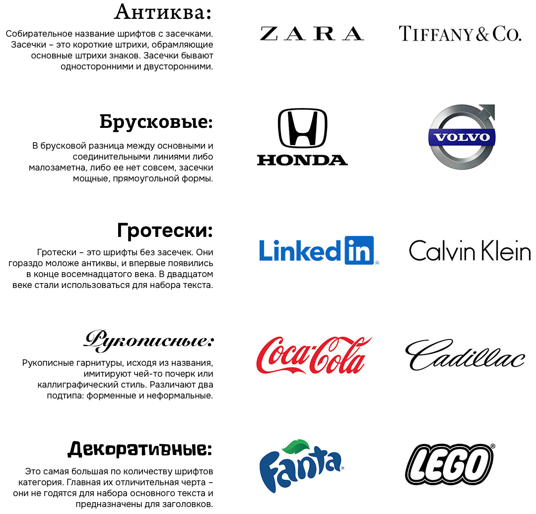
The main five big groups:
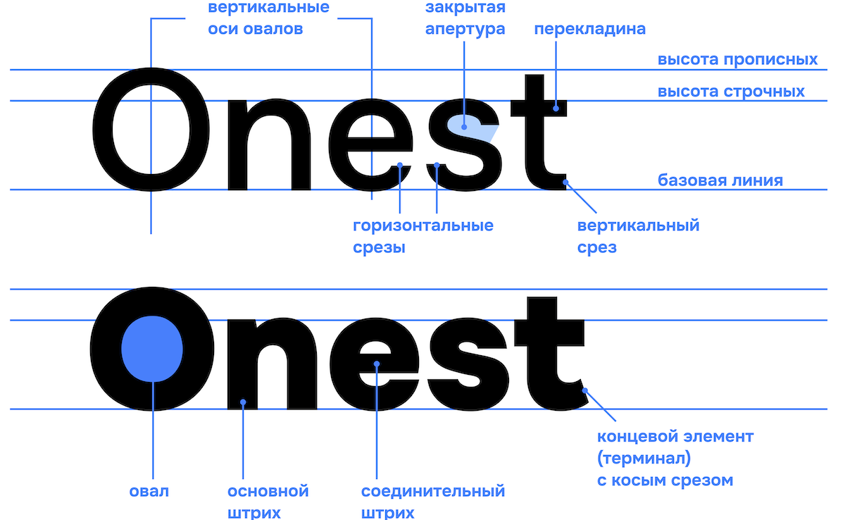
And on top of that, a rundown on the structure of the typeface and the elements it consists of:
Working as a designer, I use a lot of typefaces and I’m particularly inspired by typeface families such as San Francisco by Apple, Gotham (Obama’s campaign in America), TheSis, IBM Plex, Bebas, PF Centro, Fedra, and of course the everlasting Helvetica.
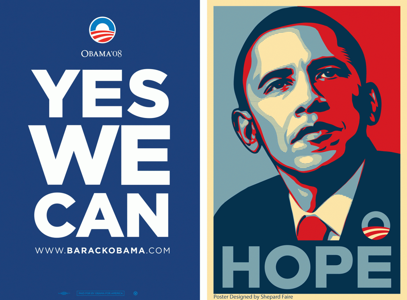
Helvetica … San Francisco … Gotham
They’re beautiful, but… Like people, each of them has a defect. Being a perfectionist myself, I could not accept such imperfections of this world and decided to create a simple, convenient and universal flawless typeface. I knew there were several decorative handwritten typefaces from Moldova, but I had not heard of a serious typeface.
In a word, it was time to create a new perfect typeface made in Moldova. This way the year started. My understanding of typefaces turned upside down. I got into this new profession and discovered the universe of typesetting.
The beginning
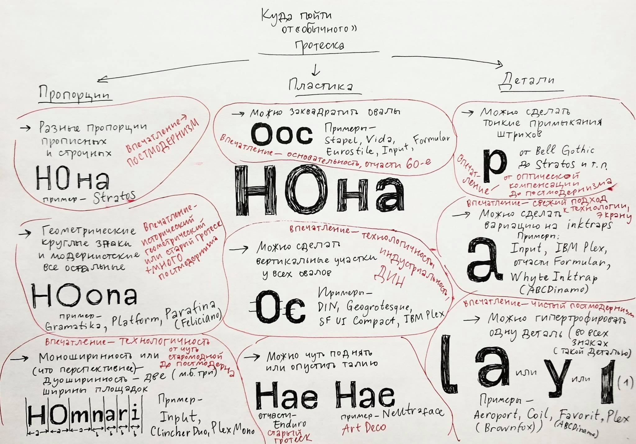
First of all, I drew a couple of the letters of the future typeface, based on titans (other typefaces). I wanted to make a typeface that would be low-contrast and as neutral as possible, a symbiosis of geometric and humanistic grotesque.
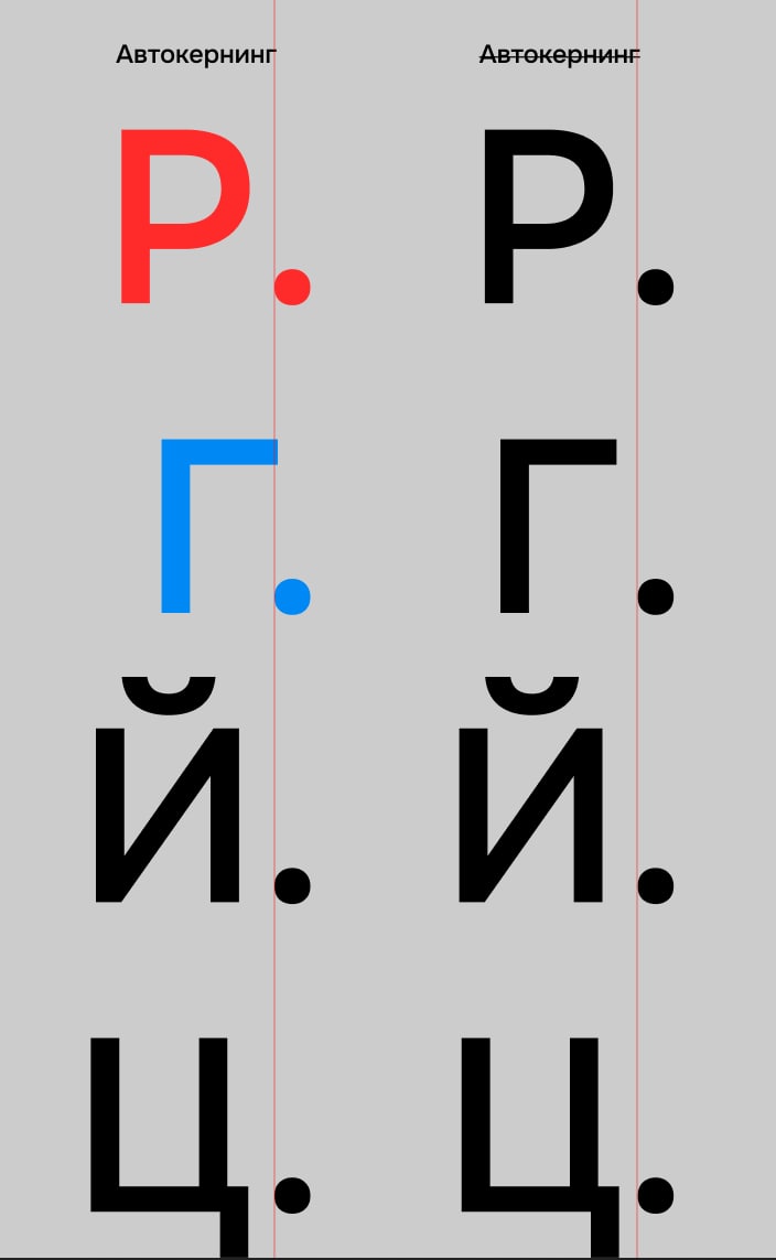
But an ordinary designer can’t make a professional typeface without knowing the million peculiarities and nuances of it. So, I started looking for a partner. And because the typeface must include the Cyrillic alphabet, I looked for a designer in Russia, because no one can draw the Cyrillic alphabet better than the Russians.
This is how I met Andrei Kudryavtsev, a very talented typographer from Russia, who had more than a dozen typefaces under his belt. We rolled up our sleeves and started work.
We spent the first month trying to understand the nature of our typeface, its rhythm and mood, how it is different from other typefaces, and what is unique about it. Then we experimented, studied analogues, drew hundreds of characters, outlines, glyphs and erased no less.
Consultant Alexandra Korolkova
Three months later, our first font – Regular – was born. Only then did we know what the first Moldovan font would be like.
It took us another 9 months to draw six more fonts, from super thin to super bold.
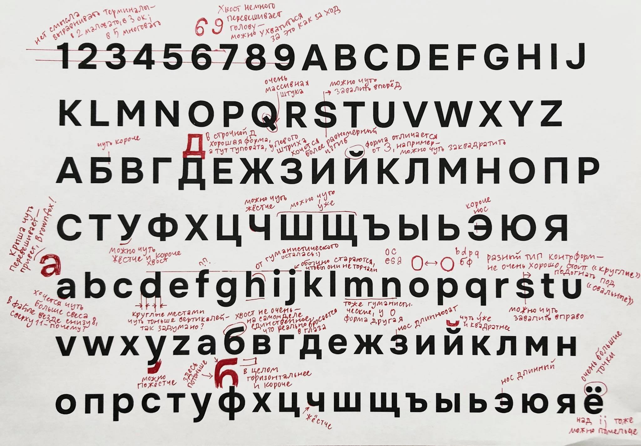
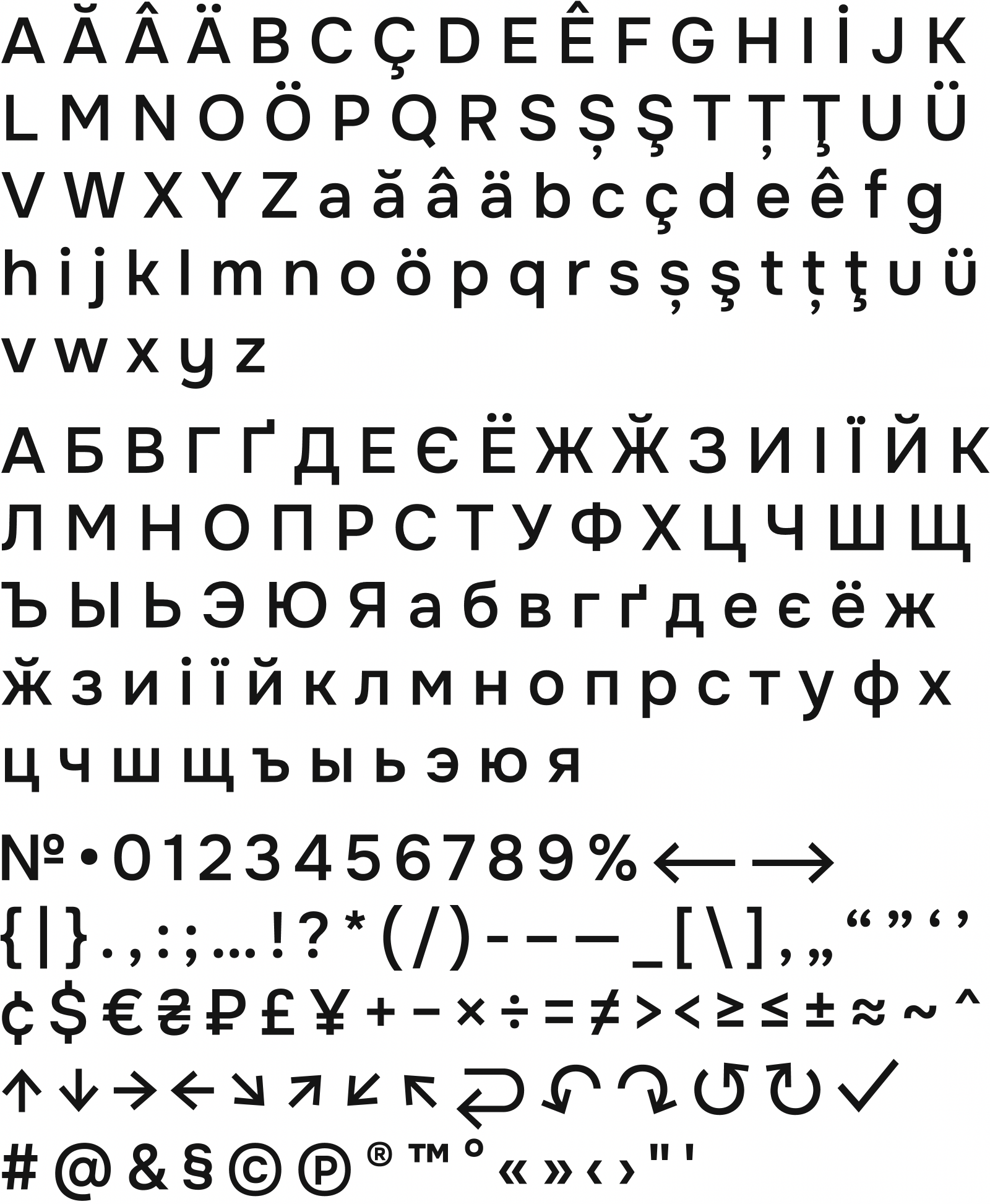
After a year of work (which is normal time for a typeface and it costs a lot), we drew 2002 letters and symbols in seven thickness variations according to all the rules of typography.
We did a great typeface – a combination of capacity and readability, so it saves space without losing readability. The letters are easy to recognize even in small sizes, so they can be used in interface elements or navigation. At the same time, it is well readable both on large billboards and on low-cost low-resolution screens.
For me, not only readability matters. It’s important that the typeface does not embellish what a person writes. I want this to be able to write both RIP and wedding congratulations. It should not influence a person’s emotions. That’s why our typeface is very simple in appearance, without bright explosions, without any crazy ligatures, but it allows to communicate in different tones:
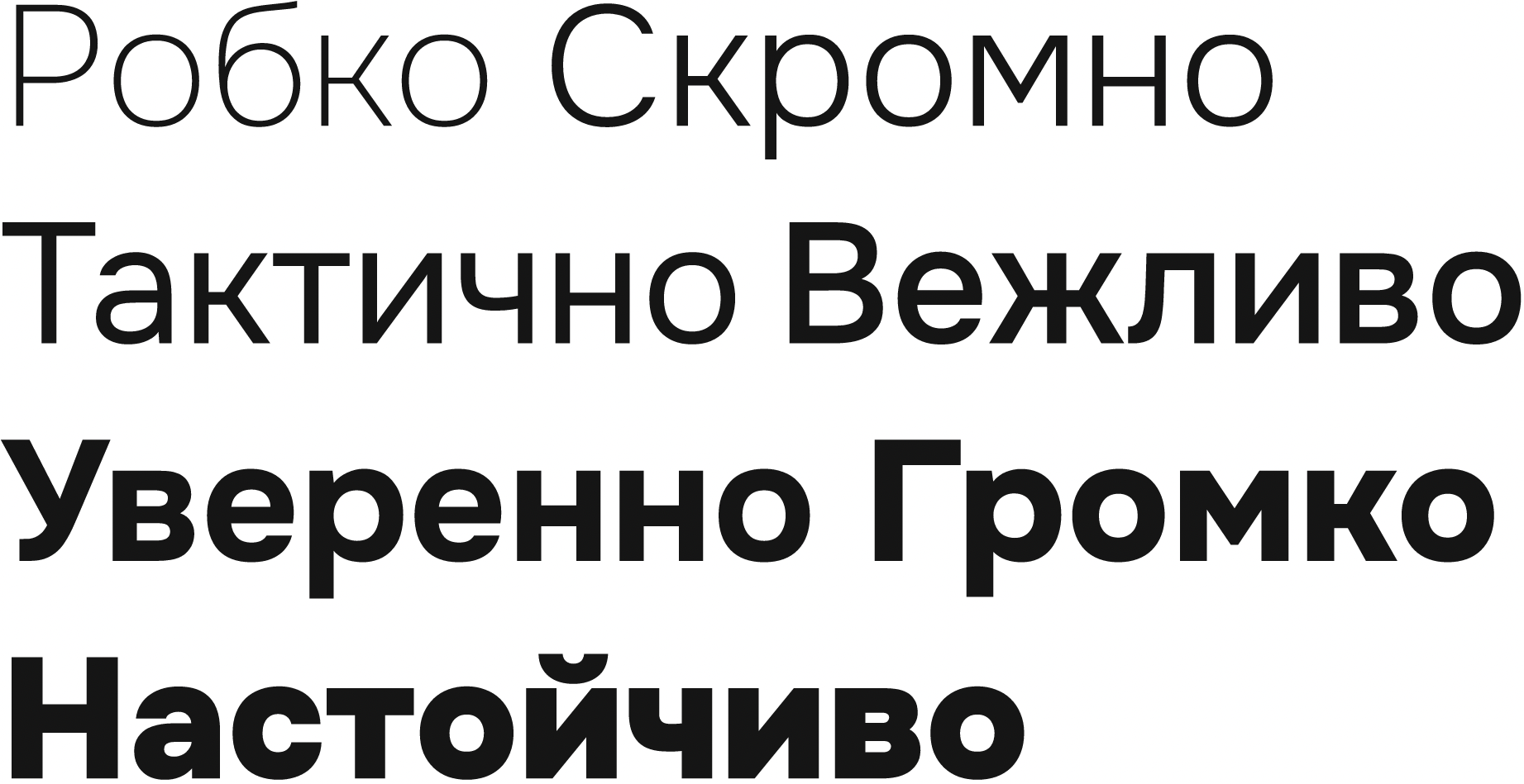
In addition to the basic Latin script, there is support for Romanian, Ukrainian, Gagauz, and Russian. The neutrality of the font forms in normal and bold styles allows the typeface to bear with long texts. And bold forms of signs reveal bright expressive forms allowing to use the typeface in advertising, packaging, and thick efficient titles.
Features
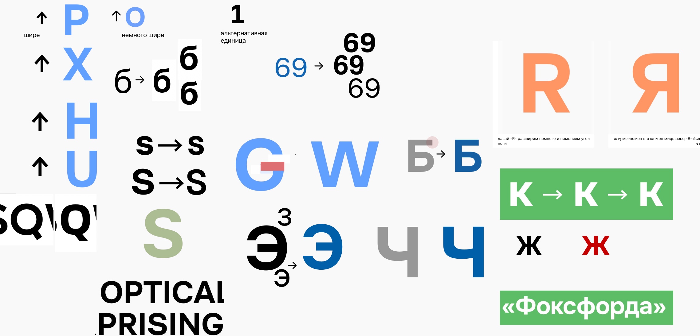
We wanted a unique typeface, having something others don’t. This is how the smart concept came about: many features for our typeface, many things to help it be modern and smart. And that became our unique feature.
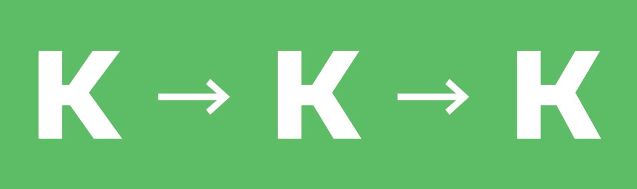
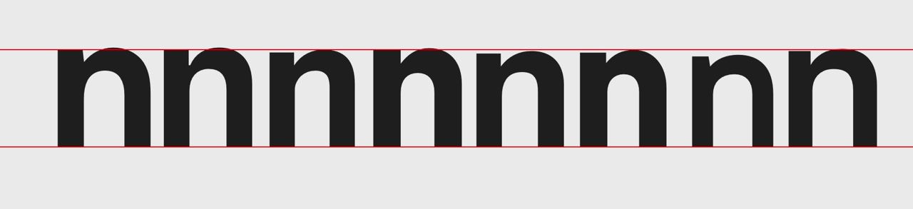
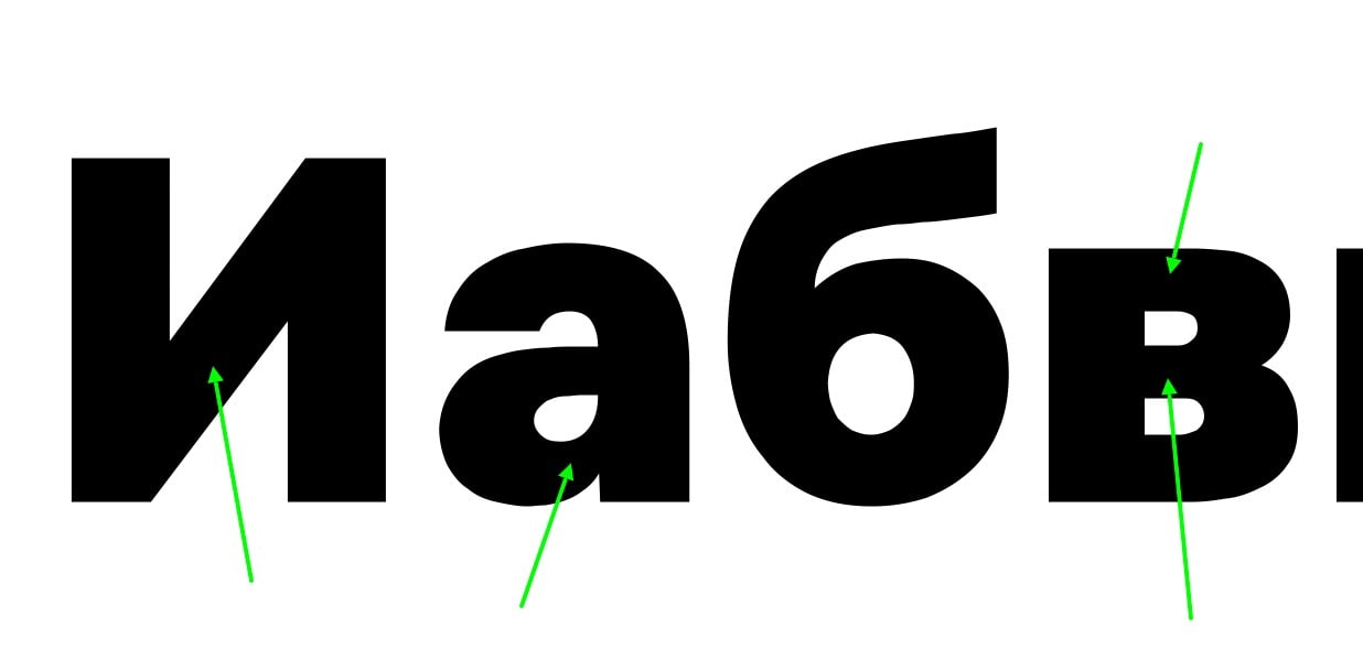
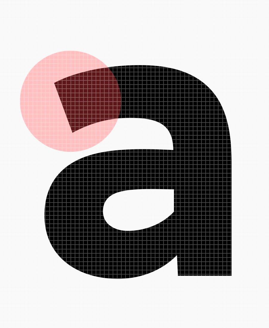
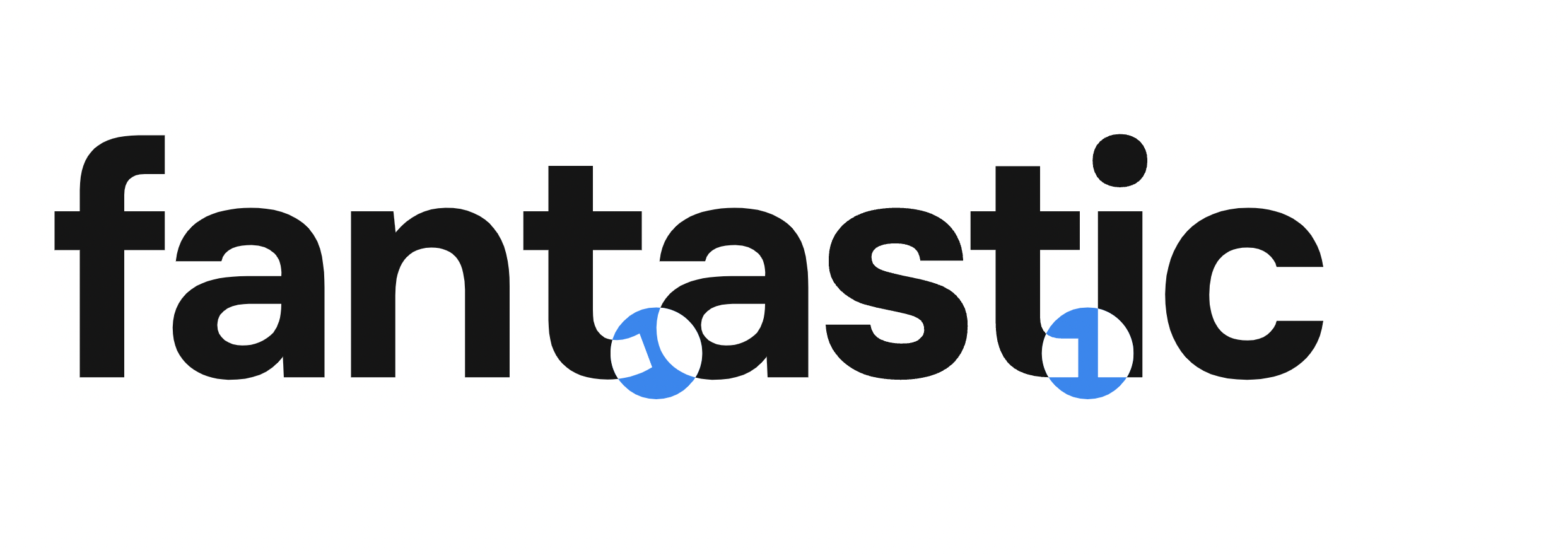
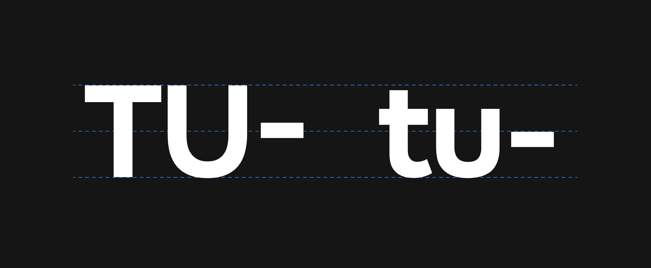
For instance, letters in our typeface try to adapt to their neighbors, changing shape depending on who’s around, in order to make the whole word readable and understandable.
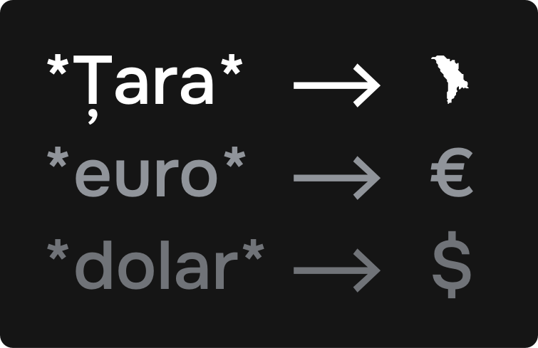
Or, for example, we have special combinations of characters that turn into signs. For instance, if you type *moldova*, it suddenly turns into a Moldovan logo. Or *euro* it turns into a € sign. Very convenient.

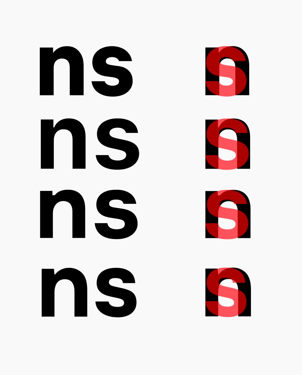
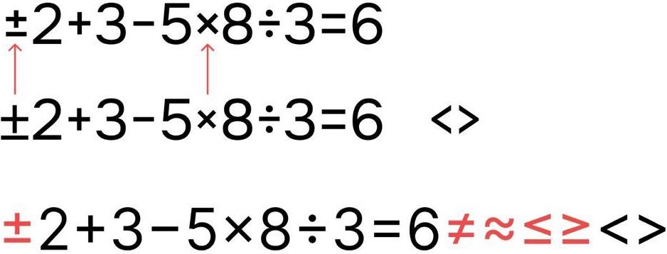
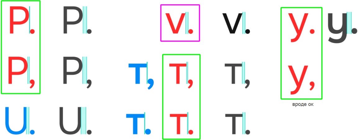
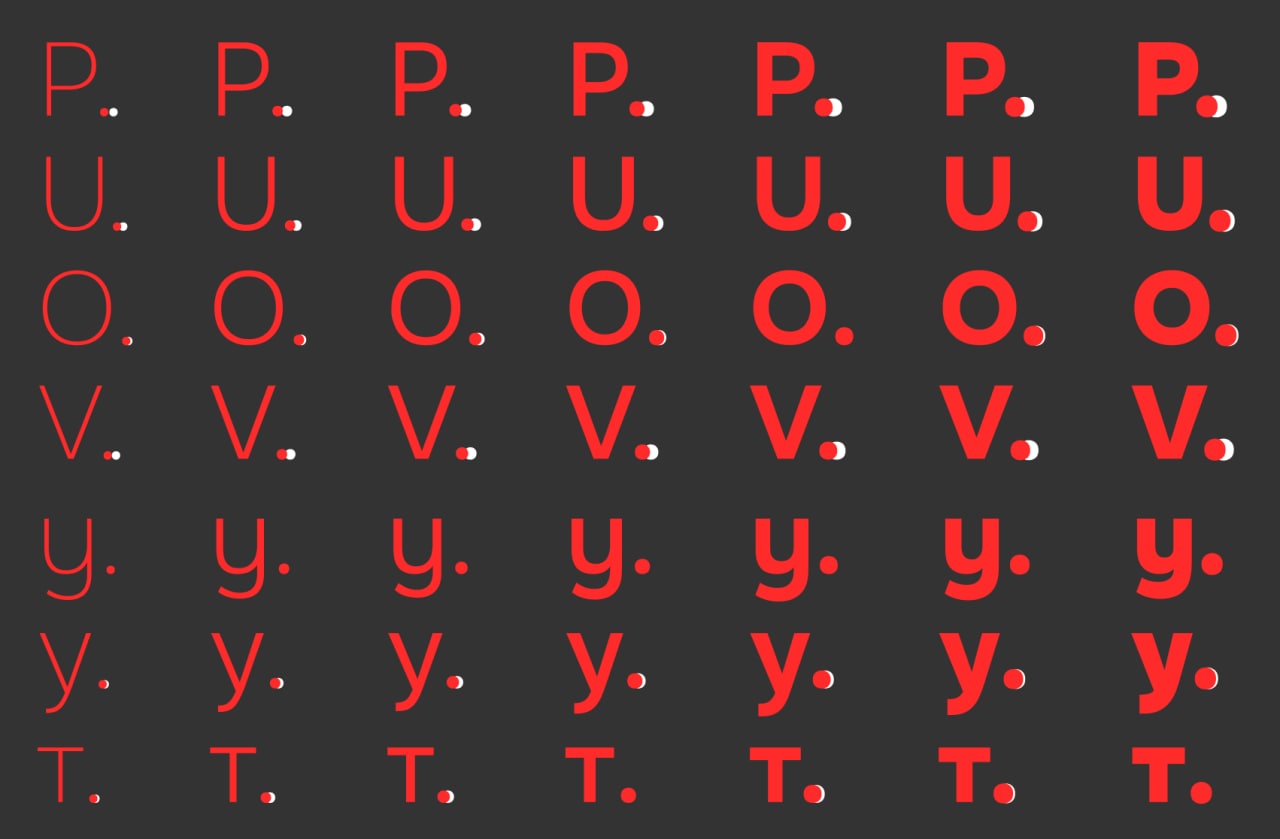
Jumping colons and dashes. These little punctuation marks are clever, too – they choose how high to go to make the text look prettier. After small letters, going lower, after big letters, higher. It’s simple.
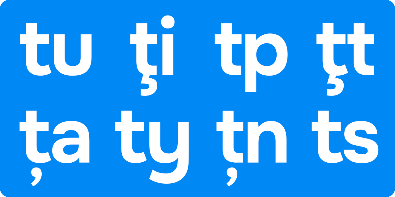
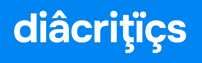
Diacritics are not as simple as they seem. For instance, can you distinguish t from t – is it a cedilla, a tail or a comma? We figured it out and now we know. Feel free to type in Romanian, there will be no mistake.
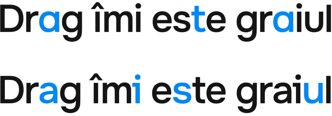
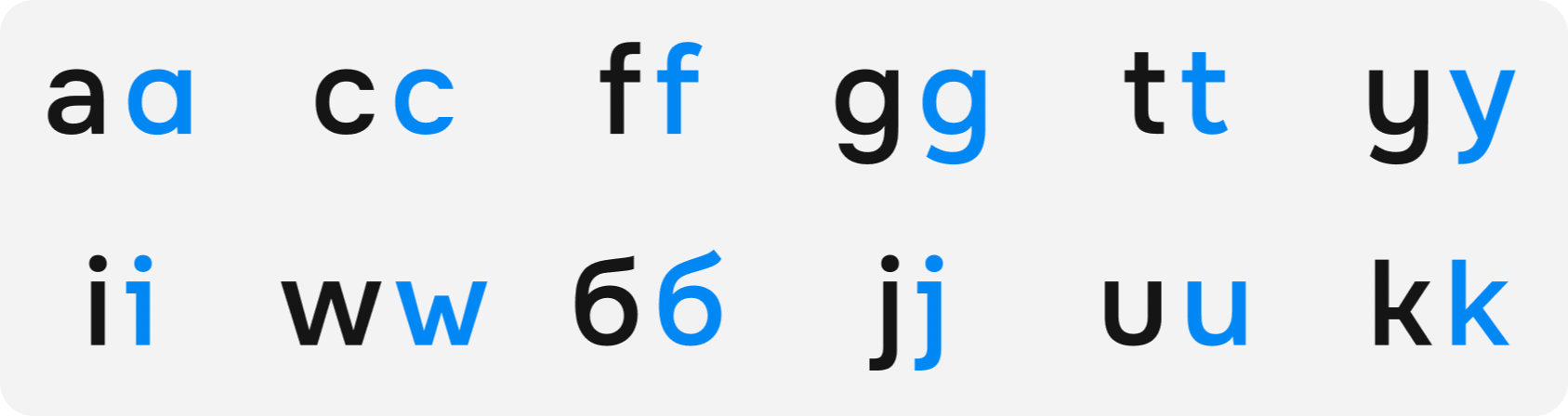
Also, the typeface has many faces: some letters have more than one face. This is done so that you can express your individuality. And the letter A has as many as three faces ????
Voice of the state
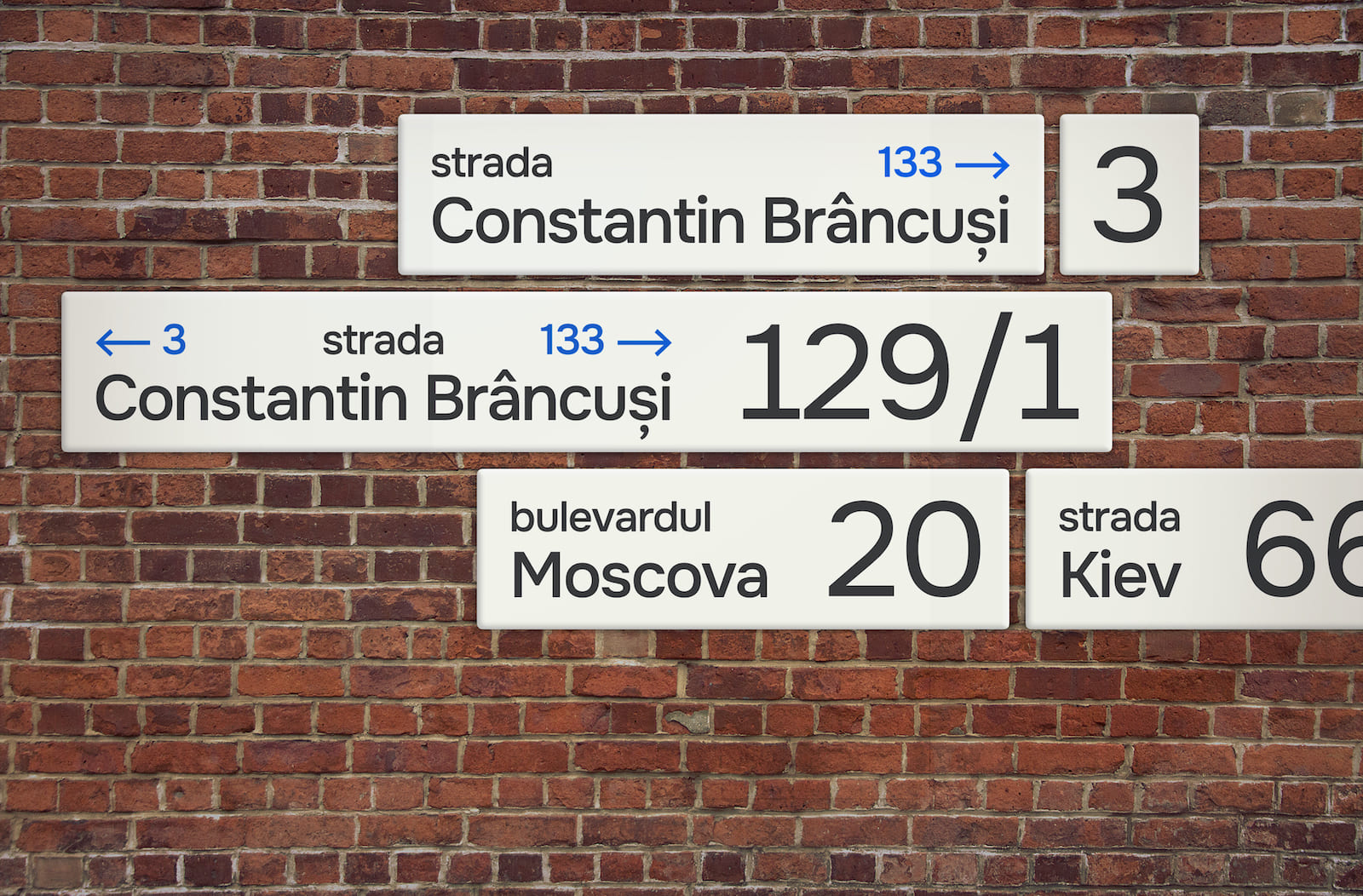
As I’ve been working on my typeface, I’ve been paying more and more attention to the typefaces around me. From gas and water bills to government websites and documents I signed. So, despite the fact that the country has a well-developed design and we don’t look like the former USSR, we are in a total mess with typography in the state’s communication with the people.
I mean on websites they write in mixed typefaces, on receipts and documents they write in mixed typefaces, logos of state companies are written in mixed typefaces. A total disaster.
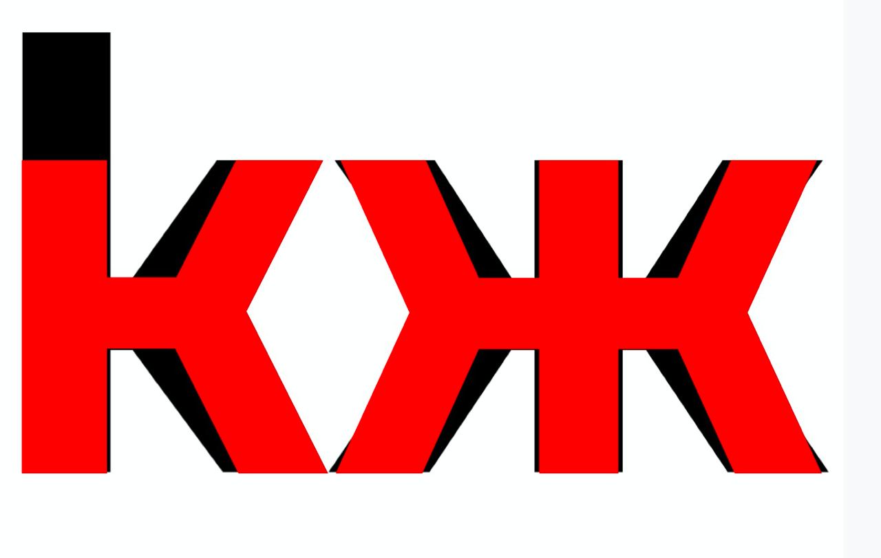
Or take the example of the Olympic Committee logo. Mind you, in the word Moldova, the initial letter M is actually an inverted W.
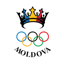
A serious typographical error! Any designer in the world would roll their eyes if they saw it. Not to mention the fact that Times New Roman was used at random.

I am ashamed that our country is represented in the world by such typographical solutions, which immediately look like they were made in a third world country. I would like “Made in Moldova” to sound modern, great, progressive.
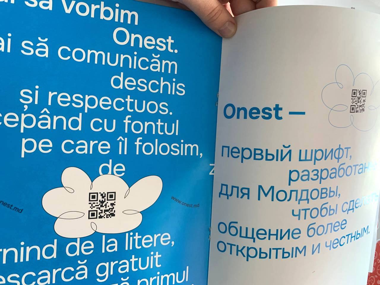
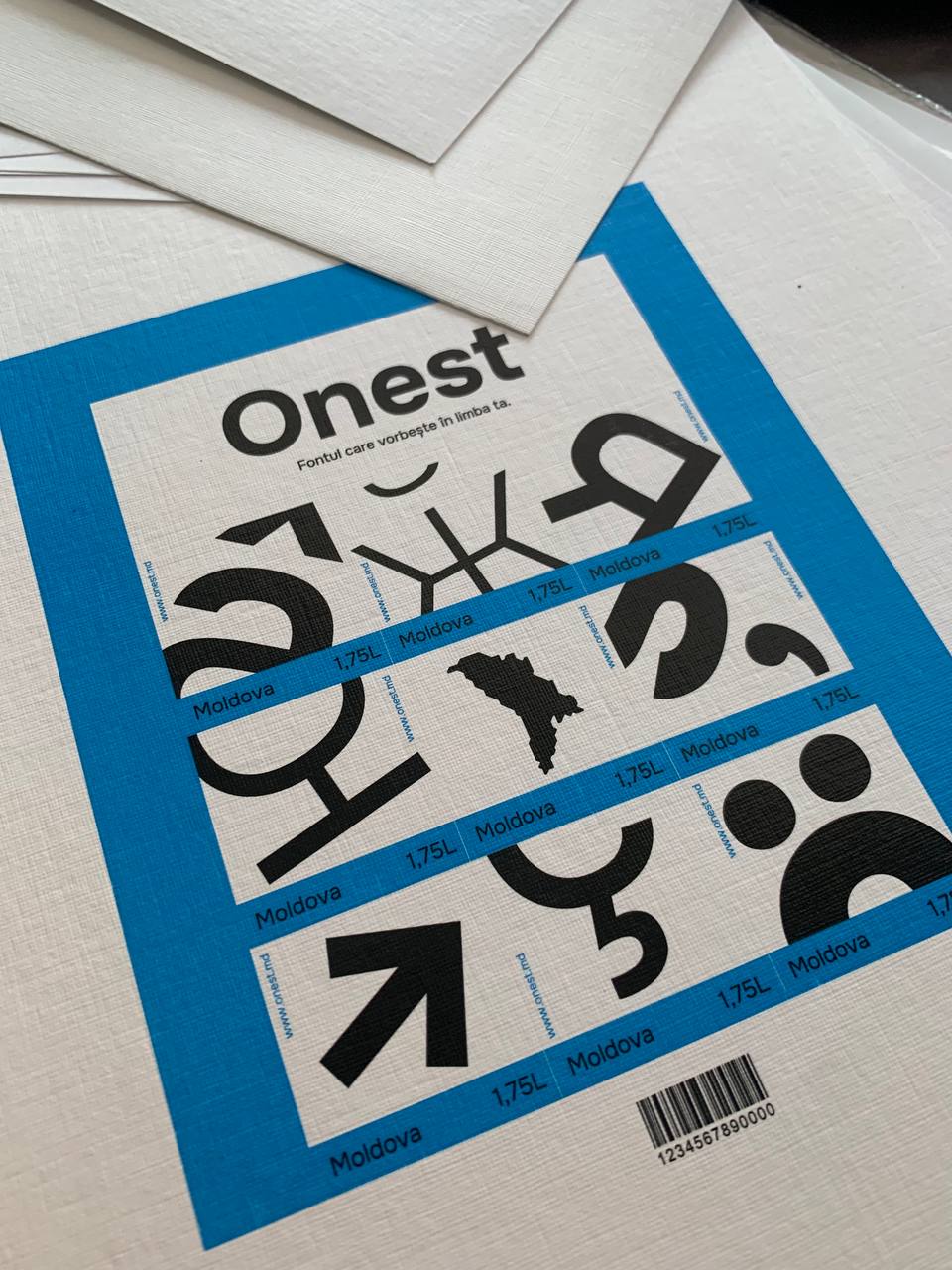
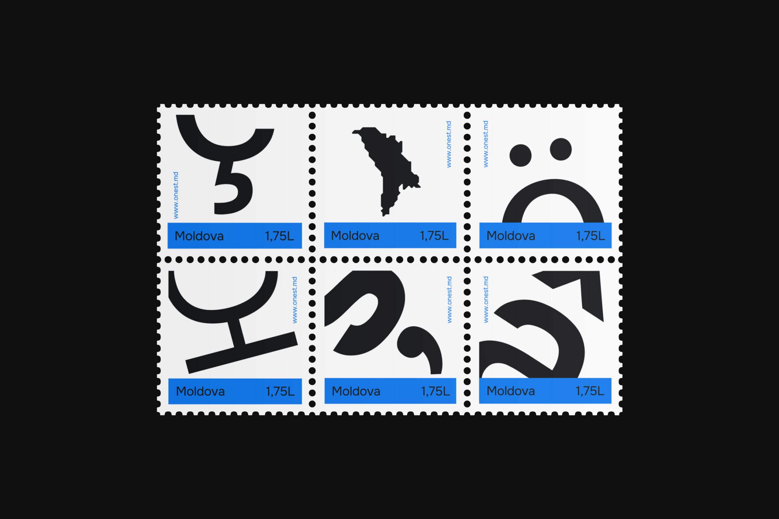
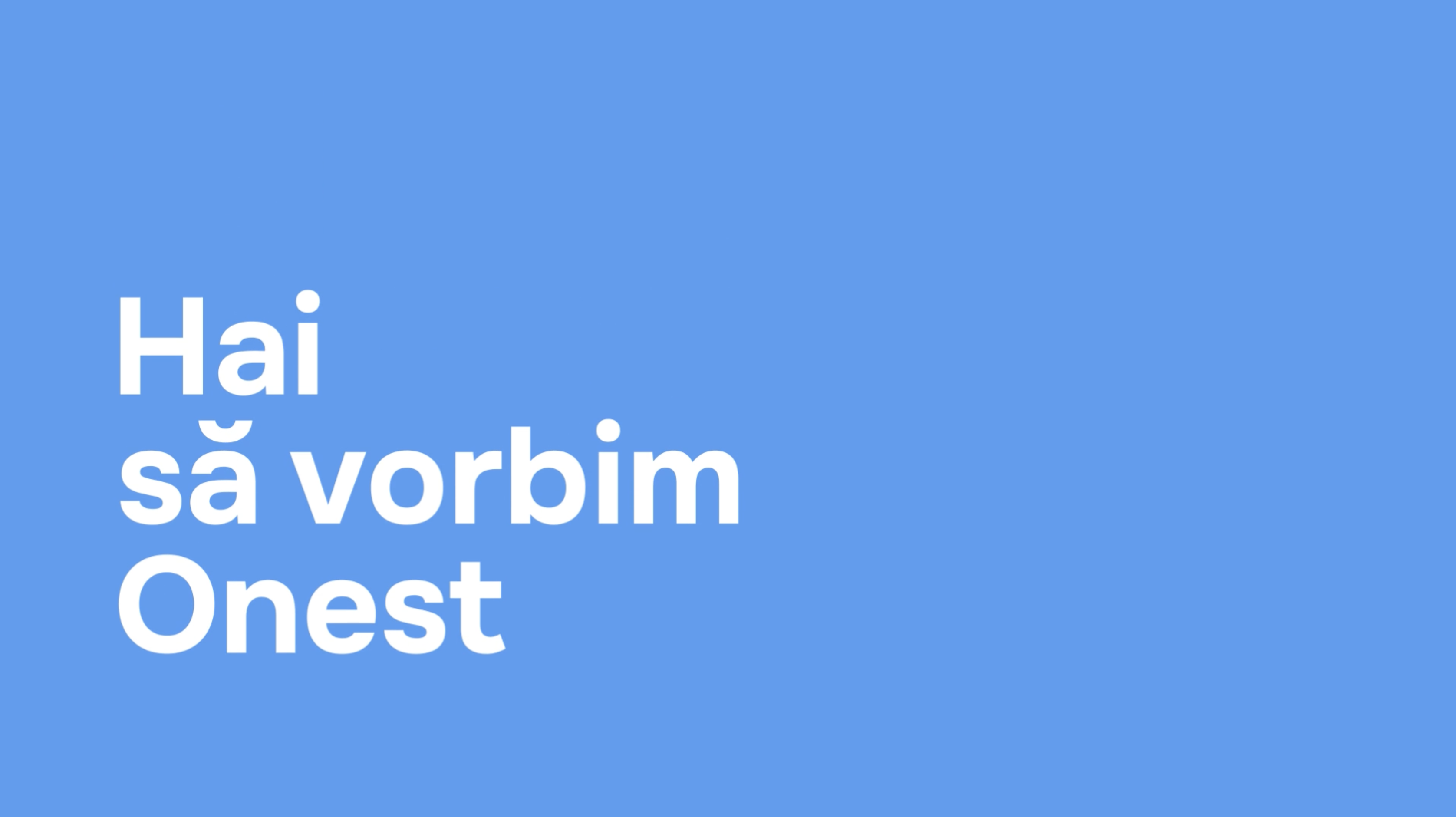
And at some point, I realized that the purpose of the typeface I was working on was to help our state. To help us communicate with us, the citizens, in a simple, clear and, most importantly, honest way. So, I decided to make the typeface free of charge and give it to Moldova, calling it Onest (Honest).
And this is where the typeface got a new lease of life. It was born again. After sharing the idea with Eugen Boico (he took over the positioning), we gathered a community of strong designers who created the website (Vitaly Kovalenko), the mockup video (Maxim Kylchik) and the film (Alexandr Berdichevsky), about the creation of the typeface, which you can watch at www.onest.md.
I would also like to thank Mikhail Tolokonnikov and Anna Vasina for the design, and Nastya Berzoy for the beautiful texts. We went through the editing again and found another dozen misunderstandings and mistakes. And now, we’re ready to launch!
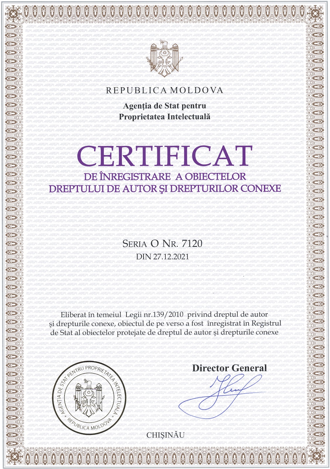
During registration of the typeface in AGEPI, we had a problem with the absence of a precedent for typeface registration in Moldova, but we helped develop the regulations and now anyone can quickly register their typeface.
With all that, Onest is free of charge for personal and commercial use, and is licensed under the SIL Open Font License
Pangram
For this site we needed pangrams in different languages. A pangram is a phrase that uses all or nearly all the letters of the alphabet. It is used to demonstrate a particular typeface on paper. Here is an example of a pangram in English:
The quick brown fox jumps over a lazy dog.
There’s even a joke about pangrams and typefaces:
– Doctor, I see typefaces everywhere. What am I supposed to do?
– My dear, relax and watch as the quick brown fox jumps over a lazy dog.
So, we couldn’t find a pangram in Gagauz. After contacting Irina Vlah, Bashkan of Gagauzia, and Irina Konstantinova – Director of the Research Center of Gagauzia M.V. Marunevich, we realized that there was no pangram in that language. So, we launched a contest for the best pangram in Gagauz. A month later, the winner was drinking champagne as we posted the first pangram in Gagauz on our website:
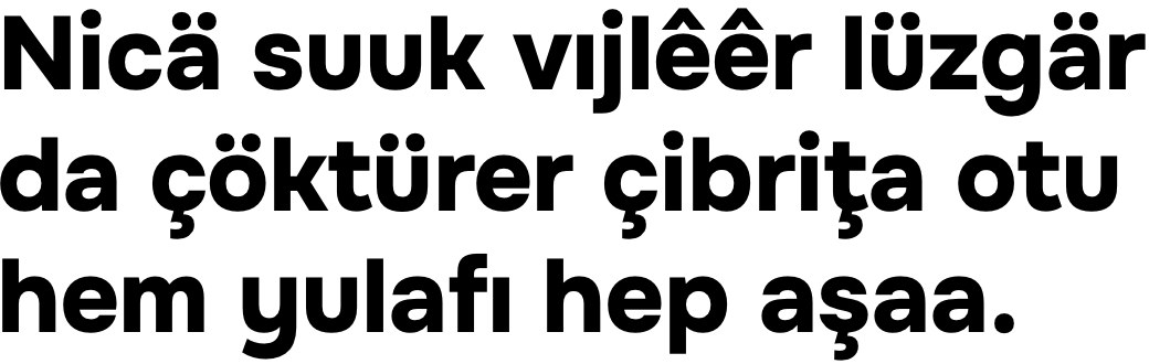
Nicä suuk vıjlêêr lüzgär da çöktürer çibriţa otu hem yulafı hep aşaa.
How cold the wind blows,
stilling the thyme and oats
lower and lower to the ground.
It translates as a Gagauz hokku. This is how the Gagauzians got their own pangram, and the Onest typeface found its first useful application.
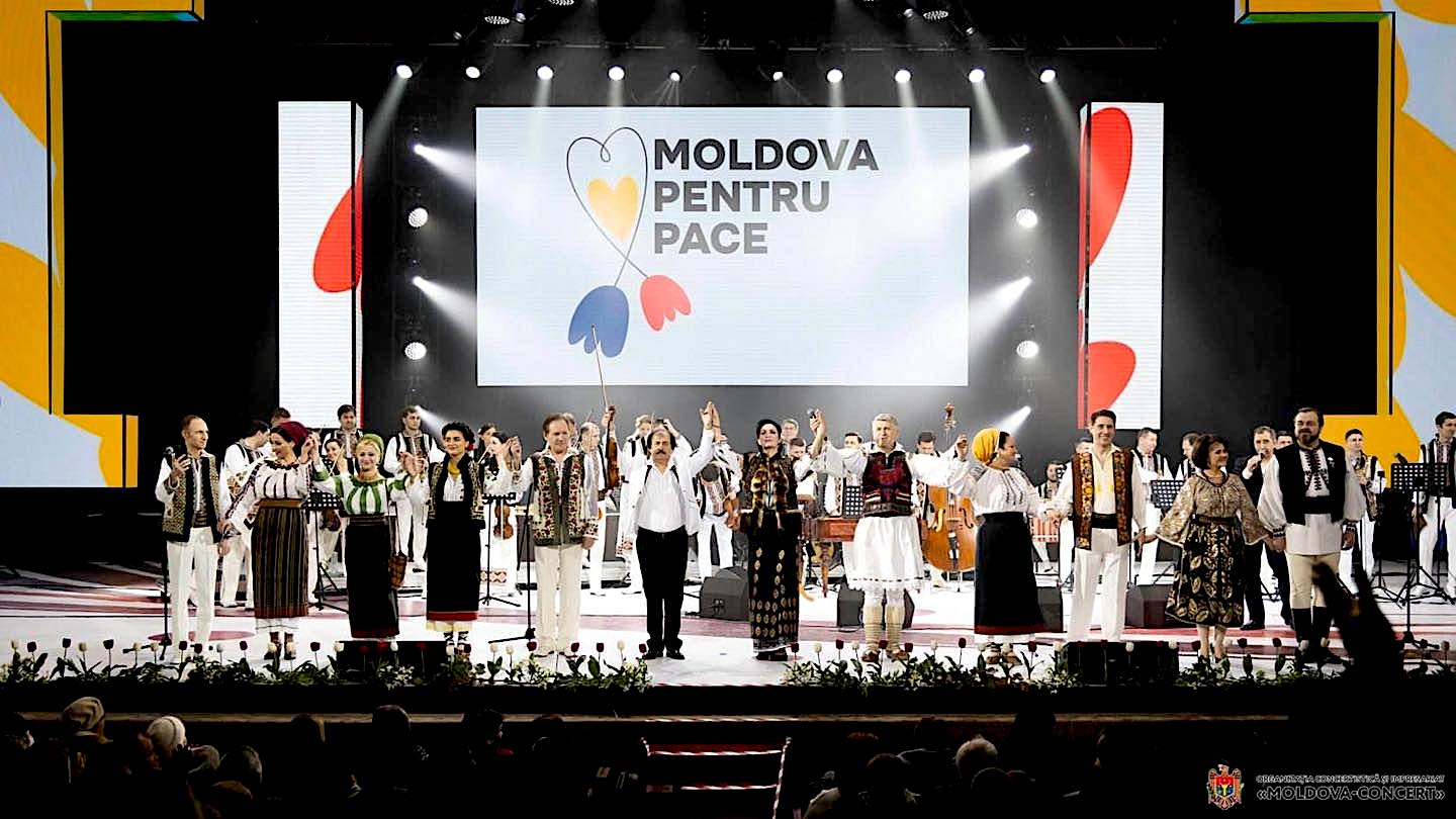
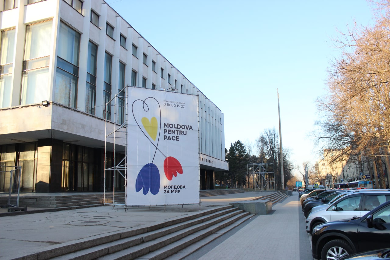
Here is another example of the way the Onest typeface has a proper application. This time, in the “Moldova for Peace” campaign.

The future
The Onest typeface, as a living creature, will evolve with our society. Therefore, we invite all those who are interested in the development of this typeface to visit our website and leave comments, because we want to do various fonts – serif, narrow version, monospaced for programmers, and other.
We now understand that the mission of the Onest typeface is not only to make communication between the state and the citizen easier and clearer, but also to allow society to work together on a product that will change the face of our country as much as possible.
Yes, Moldova still has a lot to build, but even a typeface, no matter how small and insignificant it may seem, can be the start of something bigger in our country.
To be continued…

